

A palette catches your attention because of one beautiful shimmer or an unusual pop of color. Once it is in your makeup bag, though, you keep reaching for the same two shades—or another palette entirely. The colors that attract you in the pan are not always the ones that work together in your routine.
Before buying an eyeshadow palette, check its fit with your usual looks, shade depth and undertone, finishes, controllable color payoff, blending and fallout, the evidence behind swatches, and practical value. These checks help you compare palettes beyond shade count or packaging. This guide focuses on powder eyeshadows; cream, liquid, and special-effect formulas can require different application methods.
1. Check Whether the Palette Fits the Looks You Actually Wear
Start with a look you already enjoy wearing. A soft everyday eye, a deep smoky eye, and a sparkling lid accent make different demands on a palette. You do not need every shade to work in every look, but the colors you expect to use should have a clear purpose.
Try assigning shades to one familiar combination: a main lid color, a shade for soft definition, and a deeper accent if you use one. If you prefer a single wash of color, ask which shades you would happily wear alone. This is a planning exercise, not a required makeup sequence.
In Allure’s interview with makeup artist Jillian Dempsey, the advice is to consider the selection together rather than buy an entire palette for one appealing shade. That remains a useful question: would you still want the palette without its standout color?
Compare it with what you own. A palette might fill a real gap, such as softer mattes to accompany your shimmer collection. If it repeats your existing colors and adds only one shade you want, a single shadow may be the more practical purchase.
2. Compare Shade Depth and Undertone on Skin Similar to Yours
Depth describes how light or dark a shade appears. Undertone describes its underlying color direction, such as a golden brown, reddish brown, or cooler taupe. These are separate from color payoff: how strongly the color appears after a particular application. A swatch shows that visible result; it does not measure the formula’s pigment concentration.
The useful question is how much contrast the shades create on your skin. Imagine a medium brown that gives pronounced definition on a light complexion but looks like a subtle lid shade on a deeper complexion. Its role changes even though the pan color stays the same. A “transition shade” is therefore a function in a particular look, not a universal shade category.
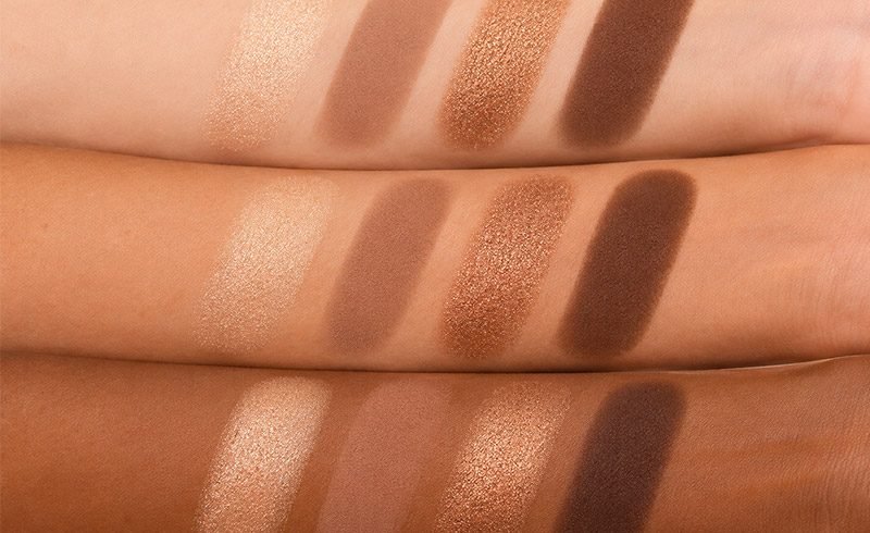
Look for swatches and finished eye looks on skin with a similar depth to yours, then assess whether the lighter, middle, and deeper colors remain distinguishable. Compare their color direction too: do you want a warm bronze effect, a muted cool look, or deliberate contrast? Matching undertones is an option, not a rule that limits which colors you can wear.
Do not judge the range only by the layout. Several browns can look distinct beside one another in the palette but provide little difference once blended. Conversely, a small selection can offer enough contrast for your usual looks. If the available images do not show that distinction clearly, leave it as an unanswered question rather than assuming the shades will work.
3. Choose Finishes You Will Use, Without a Fixed Matte-to-Shimmer Ratio
Choose finishes according to the effects you want. Matte shades generally provide color without obvious sparkle; satin has a softer sheen, while shimmer and metallic finishes offer more visible reflection. Brands use these terms differently, so compare close-up images and application demonstrations as well as labels.
| Finish | Typical visual character | What to examine before buying |
|---|---|---|
| Matte | Color with little obvious reflection | Whether the shades give useful depth and soften at the edges |
| Satin | A subdued sheen | Whether the sheen remains visible at the intensity you prefer |
| Shimmer | Visible reflective points or sparkle | How fine or noticeable the sparkle looks and how it applies |
| Metallic | A more continuous, reflective appearance | Whether that effect requires a specific tool or application method |
There is no necessary matte-to-shimmer ratio. An all-matte palette can suit someone who wants soft definition, while a shimmer-focused palette can make sense for someone who already owns the mattes they need. Buying another set of unused neutrals just to obtain a “balanced” palette adds little practical value.
Charlotte Tilbury’s four-step palette tutorial illustrates how coordinated shades can have different jobs, including adding definition and a reflective accent. It is an example of one brand’s palette system, not a requirement to use four colors or follow the same order with every product. For special-effect or glitter products, check the stated intended use and application directions rather than assuming every pan is interchangeable.
-
Sculpt & Set Clear Brow Gel
Read more -
Luxe Volume & Length Mascara
Read more -
Gold Magnetic Cream Concealer
Read more -
Velvet Touch Push-Up Lip Crayon
Read more -
Versatile 4-in-1 Face & Eye Palette
Read more -
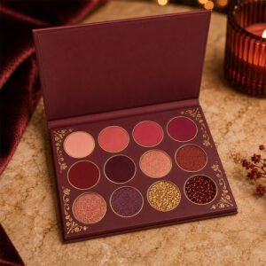
Royal Berry 12-Pan Eyeshadow Palette
Read more -
Hydrating Shine Peptide Lip Oil
Read more -
Crystal-Clear Mirror Shine Lip Gloss
Read more
4. Look for Color Payoff You Can Control
A strong swatch shows how much color a particular application deposited. It does not, by itself, tell you how easily you can create a soft edge, layer a deeper shade, or correct an overly dark area. Choose an intensity that works with the way you apply makeup.
Someone who wants bold color quickly may prefer strong initial payoff. Someone building a soft everyday look may find a more gradual application easier to manage. A sheer-looking first layer is not automatically buildable, however: the useful test is whether another light application increases the intended color evenly.
Where suitable samples or clear demonstrations are available, watch what happens with a modest amount on the usual applicator. Does the color land evenly? Can it deepen without spreading much farther than intended? When two colors meet, can you still see the distinction you wanted? Follow the product’s directions, especially for reflective formulas designed for fingertip application.
Separate preference from performance. A formula can be more intense than you enjoy without being poor quality. Uneven coverage or a shade that does not build as expected is a different issue from simply preferring a softer result.
5. Assess Blendability and Fallout in Real Application
Words such as “buttery” or “silky” describe a sensation, but they are not a complete account of how shadow applies. Useful evidence shows the product moving from the pan to the lid, including how the edge softens and where loose powder ends up.
Soften the Edge Without Losing the Color
Look for an edge that becomes softer while the main area of color stays where it was placed. If repeated blending leaves a pale gap, moves the dark shade across the whole lid, or merges several colors into an indistinct patch, the result needs closer examination. It does not establish a formula defect on its own.
Product amount, brush pressure, base preparation, and repeated blending can all affect what you see. When comparing samples, keep those conditions similar and change one factor at a time. For a closer look at application problems, use Doriff’s guide to troubleshooting patchy eyeshadow.
Distinguish Powder in the Pan from Fallout Under the Eyes
Powder loosened in the pan during pickup is not the same observation as particles falling beneath the eye during application. Particles that appear later during wear are another observation again. Record when and where the powder appears instead of treating all three as one problem.
For your own routine, consider the amount of cleanup involved and whether the finish is worth that extra step. A reflective shade that needs careful pressing may still suit occasional evening makeup. It may be less convenient if you want a quick application after finishing your foundation. Follow any specified application method before deciding how manageable the product is.
6. Read Swatches and Reviews in Context
Swatches are useful for comparing color, but their meaning depends on how they were made. Check whether the product was applied with a finger or brush, over primer or bare skin, and dry or damp where the formula allows it. Also look for information about the reviewer’s skin tone and lighting.
Temptalia’s published swatch methodology explains its brush application process, notes when primer is used, and acknowledges that finger swatches can deposit product more heavily. This supports a practical distinction: a dense stripe on an arm does not automatically predict the result of a light brush application on the eyelid.
For matte shades, a demonstration of a softly blended edge may be more informative than an opaque stripe alone. For a reflective shade, look for movement or different viewing angles so you can understand its appearance beyond one bright photograph. Screen settings and photographic conditions can still change how the image appears.
Read wear comments with similar care. An immediate swatch cannot establish how a shadow looks later in the day. A useful review describes the application conditions and what changed during wear, rather than relying only on “long-lasting.” If those details are absent, you have less evidence—not proof that the product performs badly.
7. Weigh Everyday Use Against Size, Packaging, and Price
Once a palette meets your color and application needs, consider how it fits into daily use. A compact palette may be enough for a familiar look and easier to carry. A larger palette may be worthwhile if you regularly change color combinations. Neither format is inherently better value.
Count the shades you expect to use, including those that support your favorite colors. A quiet mid-tone can be useful even if it is not exciting in a photograph. Equally, several near-duplicates may add little if they create the same effect in your routine.
Check the compact’s dimensions, closure, opening mechanism, and mirror if those features matter to you. Product photos can suggest the design, but they cannot establish how durable the hinge or closure will be. Look for clear specifications or relevant use reports rather than judging strength from appearance.
Before comparing prices, place each option into one of three groups: it meets your main needs, it needs other shadows to complete your looks, or most shades are unlikely to be used. Then compare the purchase with your budget and existing collection. Price per pan is easy to calculate, but it does not measure how useful the whole purchase will be.
8. For Brands: Turn the Seven Checks into a Clear Sampling Brief
For a beauty brand, these consumer questions can become a more precise development brief. “An everyday neutral palette” leaves many decisions open. Specify the intended users, the looks they want to create, the role of each shade, the desired initial intensity, and the tools they are likely to use.
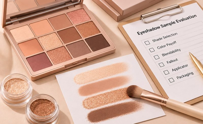
For example, a brief could ask for a soft daytime look with a visibly deeper defining shade and one reflective accent. Sample evaluation could then check whether those roles remain distinct across the target skin depths, whether the color builds with the intended tools, and whether the compact suits the expected routine. This is an illustrative framework, not a report of completed product testing.
Keep records by sample and shade, including the sample ID or version, evaluation date, applicator, base, application method, and observations, so feedback on different revisions does not become mixed together. Distinguish a color-selection issue from an application issue: a shade that is too warm for the brief needs a different discussion from one that applies unevenly under a defined method. Clear records make a revision request more useful than “make it smoother.”
Consumer-style application checks do not replace formal safety assessment, stability testing, or packaging compatibility evaluation. Doriff’s eyeshadow range and custom formulation service provide starting points for discussing product formats, shades, and textures; the requirements and supporting evidence for a specific project should be confirmed separately.
9. Frequently Asked Questions
Q1:Can I choose an eyeshadow palette online without trying it?
Yes, although some uncertainty remains. Compare swatches on similar skin tones, demonstrations with relevant tools, the intended use of each shade, and reviews that explain their conditions. This can narrow the choice, but it cannot fully establish how the formula will apply and wear in your own routine. Check the seller’s current return or sampling options before purchasing if that uncertainty matters to you.
Q2:Do I need a separate eyeshadow primer to judge a palette fairly?
Not necessarily. Follow the product directions and consider whether primer is part of your usual routine. For a meaningful comparison, use similar preparation and tools across the palettes, and note whether primer was used. If you want to compare results with and without it, treat those as separate conditions rather than attributing every difference to the shadow alone.
10. Conclusion: Choose a Palette That Works as a Whole
A useful eyeshadow palette gives you colors and finishes you will use, at an intensity you can manage, with application demands that fit your routine. Start with the looks you want, check the evidence behind the shades and formula, and weigh the whole selection against what you already own. More pans or a striking swatch cannot answer those questions for you.
If you are developing a palette for your brand, discuss your shade, texture, and packaging requirements with Doriff so the sampling brief reflects the people and looks you intend to serve.